
LocalLoom
LocalLoom
Local Loom
Overall Details
The Problem
Travelers often rely on generic guides and/or outdated recommendations when exploring new cities, and any current companion travel tools don’t adapt to personal budgets, integrate with flight schedules, or consider real-time local context.
The Problem
Travelers often rely on generic guides and/or outdated recommendations when exploring new cities, and any current companion travel tools don’t adapt to personal budgets, integrate with flight schedules, or consider real-time local context.
The Solution
Create an end-to-end mobile application that delivers personalized recommendations for passionate travelers.
The Solution
Create an end-to-end mobile application that delivers personalized recommendations for passionate travelers.
Impact
90% of users felt the app was easy to navigate overall.
Users feel less overwhelmed when planning group trips.
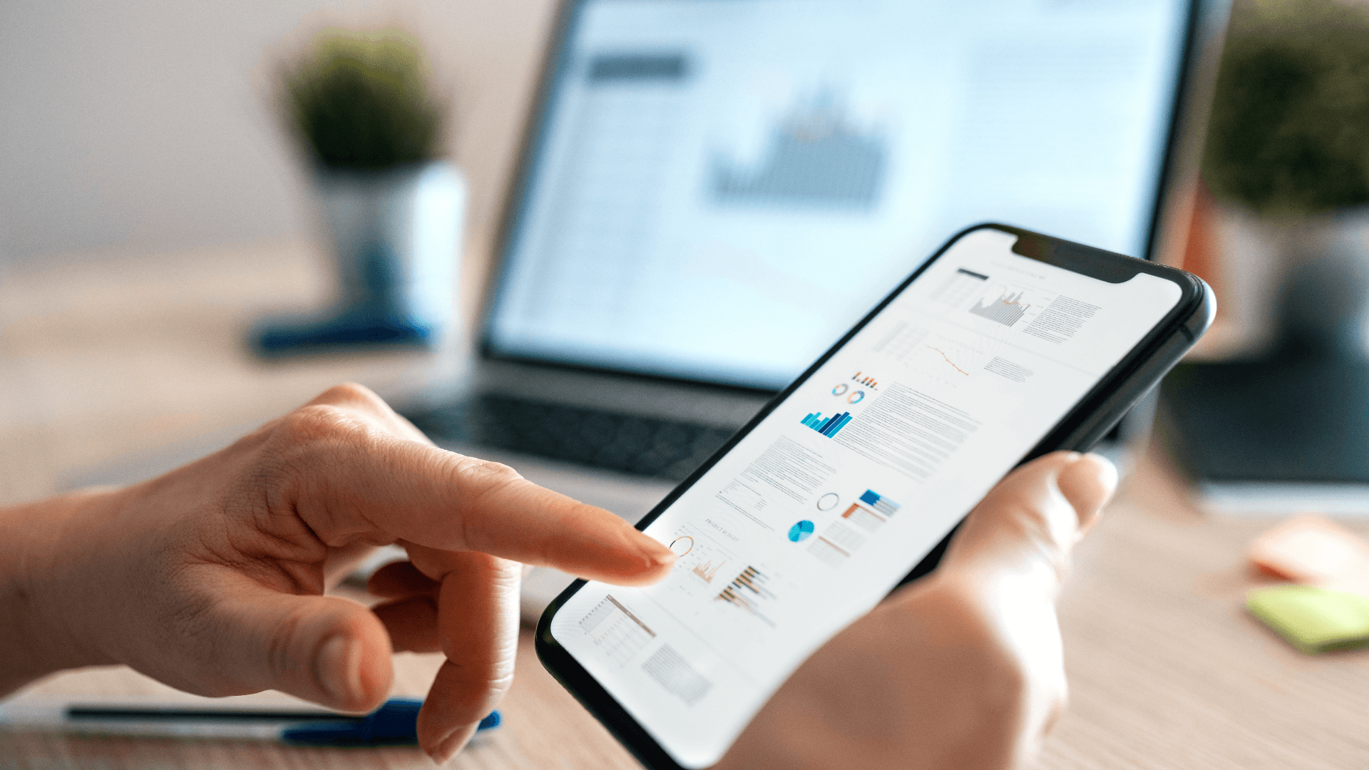
Final Wireframes
Final Wireframes


So, how did I plan the project?
So, how did I plan the project?
Project Planning
Project Background
For this capstone project, I designed an End-to-End mobile Application named LocalLoom. This app delivers local tips based on weather, location, trip timing and budget.
Project Background
For this capstone project, I designed an End-to-End mobile Application named LocalLoom. This app delivers local tips based on weather, location, trip timing and budget.
Project Details
This is a capstone project for the course UX Academy, not a commercial project.
Project Details
This is a capstone project for the course UX Academy, not a commercial project.

Role
Role
UX/UI Designer with support from mentor (DesignLab Project)
UX/UI Designer with support from mentor (DesignLab Project)
Project Type
Project Type
End-to-End Mobile Application
End-to-End Mobile Application


Timeline
Timeline
July 2025
July 2025
Industry
Industry
Travel & Hospitality
Travel & Hospitality


Tools Used
Tools Used
Figma, Canva, Zoom, Calendly
Figma, Canva, Zoom, Calendly
Research
Competitor Analysis
I compared the features, strengths, and weaknesses of the 3 top travel planning mobile applications: Wanderlog, Roadtrippers, and Airbnb Experiences.
To view full competitive analysis click on "Download" button below.
The analysis showed that there is an opportunity for creating a mobile app that is experience-based, safe, free* and sufficient features for travelers to use. It's important to keep in mind what features to prioritize in this design to make it even further stand out. An important opportunity that this review revealed, was the concern for data privacy and overall safety.


User Interviews
User Interviews
Research Goal
Research Goal
We want to identify how modern travelers discover and plan local experiences while incorporating personalized budgets and real-time trip logistics (flight times, weather, schedule constraints)- as well as data sharing with travel tools.
Method
Method
1 interview with 5 participants via Zoom [30-45 min]
Target Audience: Passionate travelers, digital nomads, and culture seekers.
Results [User Interviews]
Results
[User Interviews]


Survey
Survey
Research Goal
Research Goal
Determine which two devices users use most (prefer) during the entirety of the travel experience (before, during, and after).
Method
Method
Brief Google Form sent to 20 frequent travelers (have travelled at least 3 times in the last 6 months).
Results [Survey]
Results [Survey]


User Personas
User Personas


Affinity Map [User Interviews]
Affinity Map [User Interviews]
Prioritization and Roadmapping
Buisness Goal:To stand out within the increasingly competitive market, by being the app that has it all in one place.
Feature Roadmap
Using a feature set template provided by DesignLab, the following features were mapped out and prioritized per user needs.
Feature Roadmap
Using a feature set template provided by DesignLab, the following features were mapped out and prioritized per user needs.


Sitemap
I mapped out how the important pages will be laid out- essentially a blueprint for content organization and user navigation.
Sitemap
I mapped out how the important pages will be laid out- essentially a blueprint for content organization and user navigation.

User Flows
I mapped the primary route a user would take:
1. Solo Traveler creates new trip.
2. Solo Traveler searches new activity (local recommendation) for upcoming trip.
3. Group Traveler creates new group trip.
4. Group Traveler searches new activity (local recommendation) for current trip.
User Flows
I mapped the primary route a user would take:
1. Choosing what to watch.
2. Solo Traveler searches new activity (local recommendation) for upcoming trip.
3. Group Traveler creates new group trip.
4. Group Traveler searches new activity (local recommendation) for current trip.


Branding
MoodBoard
MoodBoard
When thinking how to start the branding, I developed the following Moodboard.
Core Values:
1. Authenticity: Every experience/activity should feel true to the culture and community.
2. Personalization: No two trips should ever be the same.
3. Curiosity: Celebrate exploration and open-mindedness as the heart of travel.
4. Accessibility: Make immersive experiences approachable for all types of travelers.
To view full Moodboard click on download:
Logo
Logo
Creating these logos meant making sure the name was catchy and simple for users to remember. I also wanted to make sure the logo(s) looked modern and can be simplified to favicons.
Creating these logos meant making sure the name was catchy and simple for users to remember. I also wanted to make sure the logo(s) looked modern and can be simplified to favicons.

Logo Finalist Option 1

Logo Finalist Option 2

Style Tile
While keeping the core values, the following style tile was created.
Style Tile
While keeping the core values, the following style tile was created.

Wireframes
Low-Fidelity Wireframes
Low-Fidelity Wireframes
The low-fidelity wireframes below focused on the layout, navigation, and forms.
The low-fidelity wireframes below focused on the layout, navigation, and forms.
Low-Fidelity Testing
Low-Fidelity Testing
To encourage early testing, the following low-fidelity screens were tested in a high-level manner
Research Goal: Find out how easily users can navigate throughout the wireframes and are able to complete the pre-determined tasks.
Method: 1 Interview 5 participants via Zoom.
Pre-Determined Tasks:
1. Creating a new group trip.
2. Adding a new activity to upcoming group trip.
3. Adding activity to current solo trip.
Low-Fidelity Results
Overall users found this feature easy to navigate.
The majority of users expressed the need of having access to these tasks from the home page.
Several users suggested sticking the navigation dock and the pop-up message (of action options) to the middle of the screen.
Several users suggested having more CTA buttons on the home page.
Several users suggested improving the verbs used when labeling certain buttons like “learn more”.
Next Steps
Improve home access to the main tasks (adding trip, etc) .
Improve call-to-actions labeling.
Improve footer and pop-up message access.
Test the revised hi-fidelity wireframes through usability testing.
Next Steps
Improve home access to the main tasks (adding trip, etc) .
Improve call-to-actions labeling.
Improve footer and pop-up message access.
Test the revised hi-fidelity wireframes through usability testing.
High-Fidelity Wireframes
After reviewing the low-fidelity wireframes with users in testing, the following High-fidelity wireframes were created.
High-Fidelity Wireframes
After reviewing the low-fidelity wireframes with users in testing, the following High-Fidelity wireframes were created.

Add A New Feature
Per user feedback, home access to the main tasks was improved.

Add A New Feature
Per user feedback, home access to the main tasks was improved.

Add A New Feature
It was also important to improve CTA labeling.

Add A New Feature
It was also important to improve CTA labeling.

Add A New Feature
Improve pop-up message (of actions) to the middle of screen.
Add A New Feature
Improve pop-up message (of actions) to the middle of screen.

Add A New Feature
Improve pop-up message (of actions) to the middle of screen.

Per user feedback it was important to keep UI consistent across all screens, including the CTA buttons.

I wanted to keep the form as simple as possible.

Per user feedback it was important to keep UI consistent across all screens, including the CTA buttons.
Per user feedback it was important to keep UI consistent across all screens, including the CTA buttons.

I wanted to keep the form as simple as possible.
UI Design
UI/Visual Design
UI/Visual Design
Add A New Feature
It was important to keep the branding just two colors, considering the heavy use of imagery.
Add A New Feature
It was important to keep the branding just two colors, considering the heavy use of imagery.
Add A New Feature
The UI design also needed to be clean, so users can focus on the actions.
Add A New Feature
The UI design also needed to be clean, so users can focus on the actions.
Add A New Feature
I wanted to assure users can properly distinguish the menu actions from the background.
Add A New Feature
I wanted to assure users can properly distinguish the menu actions from the background.
UI Kit
UI Kit

Testing & Iterations
Testing & Iterations
Usability Testing [High-Fidelity Prototype]
Usability Testing [High-Fidelity Prototype]
Research Goal: Find out how easily users can navigate throughout the wireframes and are able to complete the pre-determined tasks.
Method: 1 Interview 5 participants via Zoom.
Pre-Determined Tasks:
1. Creating a new group trip.
2. Adding a new activity to upcoming group trip.
3. Adding activity to current solo trip.
To encourage early testing and early iteration, the following low-fidelity screens were tested in a high-level manner.
Research Goal: Find out how easily users can navigate throughout the wireframes and are able to complete the pre-determined tasks.
Method: 1 interview 5 participants via zoom.
Pre-determined tasks:
1. Choosing content to watch per mood/emotional state.
2. Save a mood to panel.
3. Going to "Saved Moods" Panel.
Usability Test Results
Usability Test Results


Revisions
Revisions

Add A New Feature
Revision 1:
Fix home page “upcoming trips” section, by adding preview text on e/ component .
Add A New Feature
Revision 1:
Fix home page “upcoming trips” section, by adding preview text on e/ component .
Add A New Feature
Revision 1:
Fix home page “upcoming trips” section, by adding preview text on e/ component .

Add A New Feature
Revision 2:
Define home page access to “upcoming trips” so users can add activity through there.

Add A New Feature
Revision 2:
Define home page access to “upcoming trips” so users can add activity through there.

Add A New Feature
Revision 3:
Consolidate different home page for when user is currently on a trip-

Add A New Feature
Revision 4:
Improve UI of activity details and upcoming trip.

Add A New Feature
Revision 4:
Improve UI of activity details and upcoming trip.

Add A New Feature
Revision 4:
Improve UI of activity details and upcoming trip.

Add A New Feature
Revision 5:
Fix help button only where necessary and leave for access in hamburger menu [activate this]

Add A New Feature
Revision 6:
Provide explanation for poll.

Add A New Feature
Revision 6:
Provide explanation for poll.
Prototype
Prototype
Final Reflection
Lessons Learned:
1. Trust the user testing process and it's power.
2. Less steps for the user is better.
3. Trust your instinct for making features simple and easy for user.
Future Opportunities:
1. Add allergen information.
2. Conduct a similar survey but to 50 participants.
3. Add chat option with other members.
4. Add the wishlist feature.
Ready to Achieve Your Goals?
I’ll help you reach new heights and stay ahead of competitors.
Ready to Achieve Your Goals?
I’ll help you reach new heights and stay ahead of competitors.
Ready to Achieve Your Goals?
I’ll help you reach new heights and stay ahead of competitors.